Downtown CENTRO San Antonio
“It takes courage to grow up and become who you really are.” — E.E. Cummings
The Mission
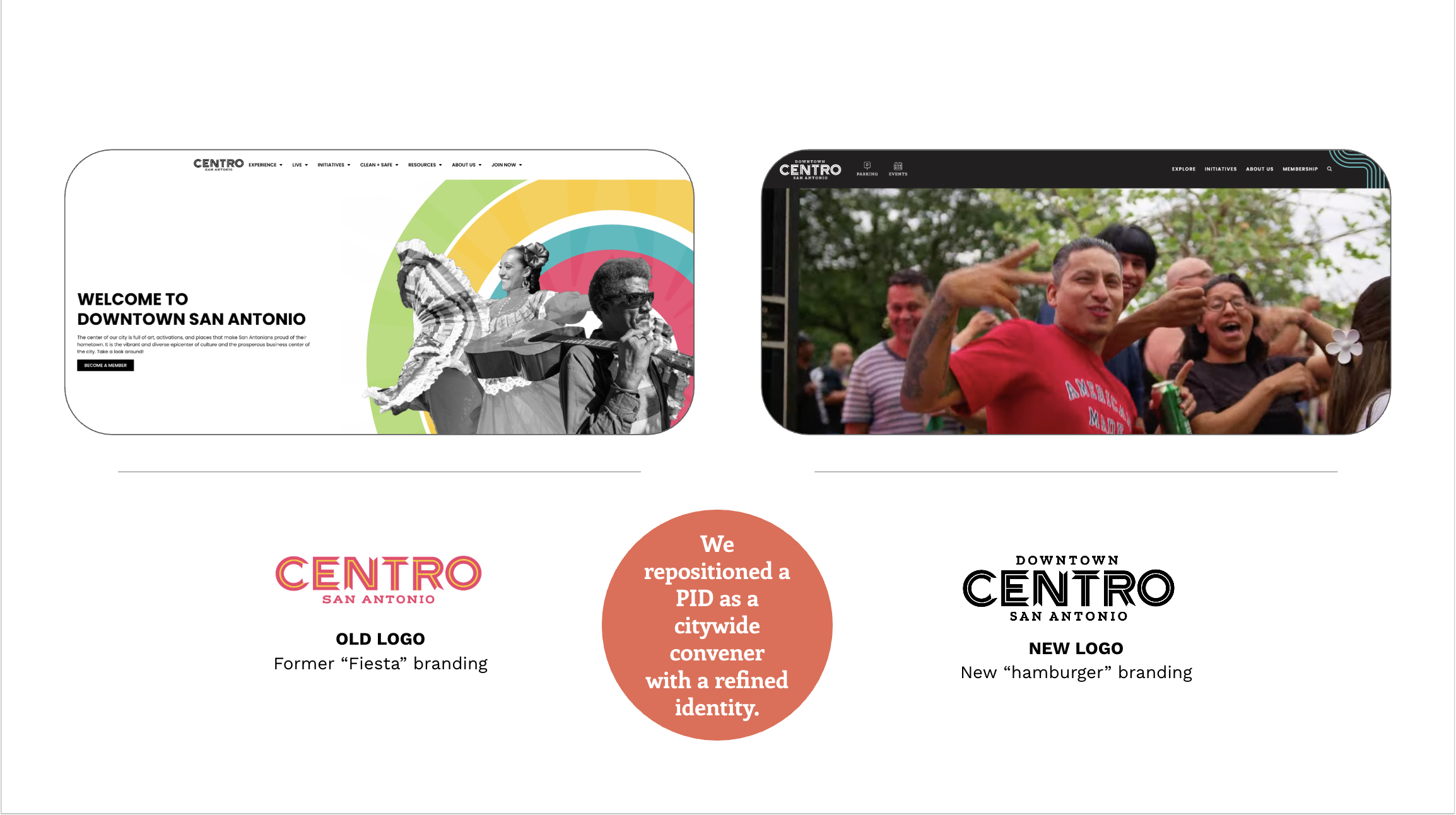
CENTRO San Antonio, the urban place management organization responsible for the beloved Texan destination’s downtown had evolved. Under new leadership, the PID wished to update its visual identity. They weren’t necessarily dissatisfied with the previous identity, but it felt overly flashy and vibrant, too touristy and didn’t properly position the organization or its mission. They were looking for something a little more “buttoned up” without foregoing the brand equity they’d built up over the years.
The Approach
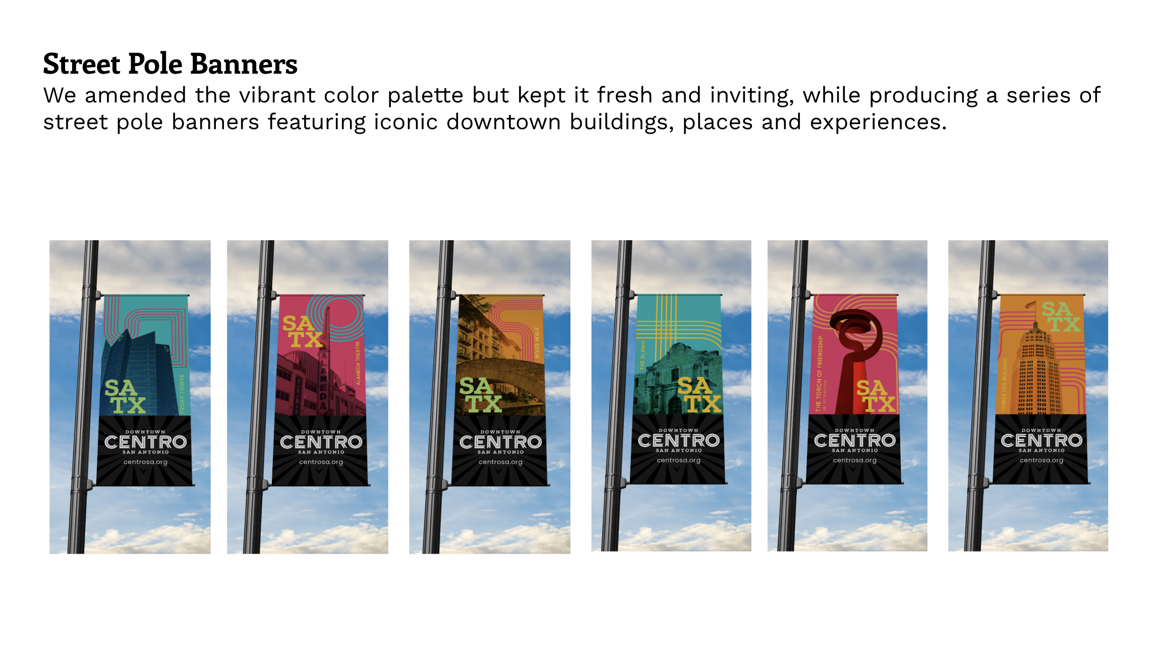
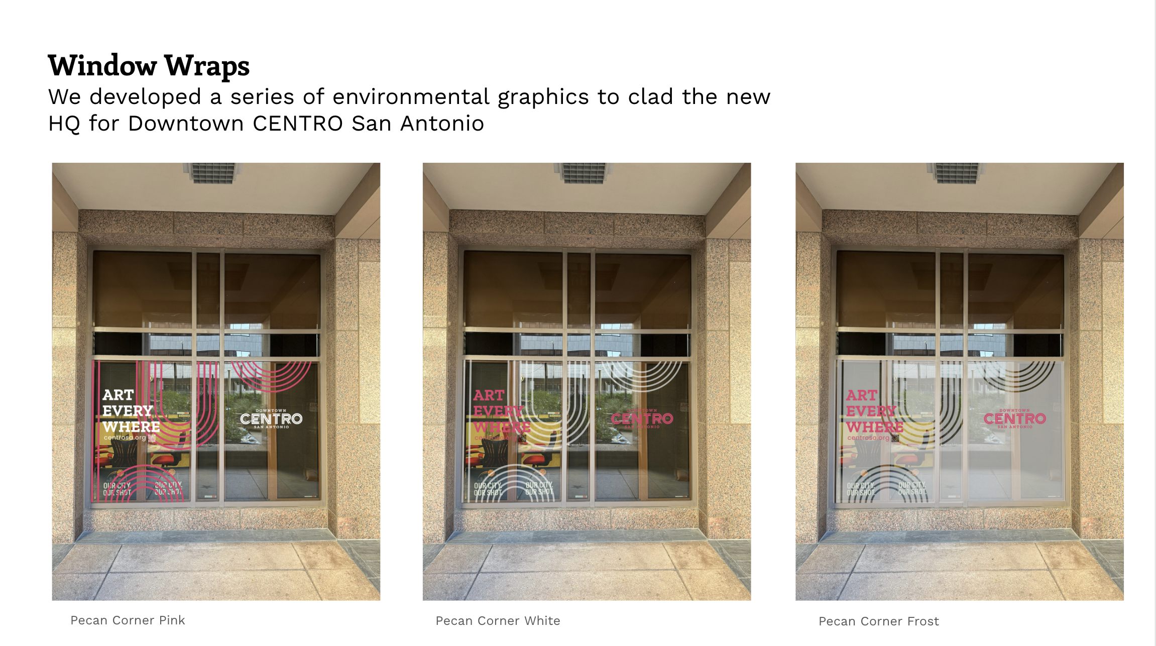
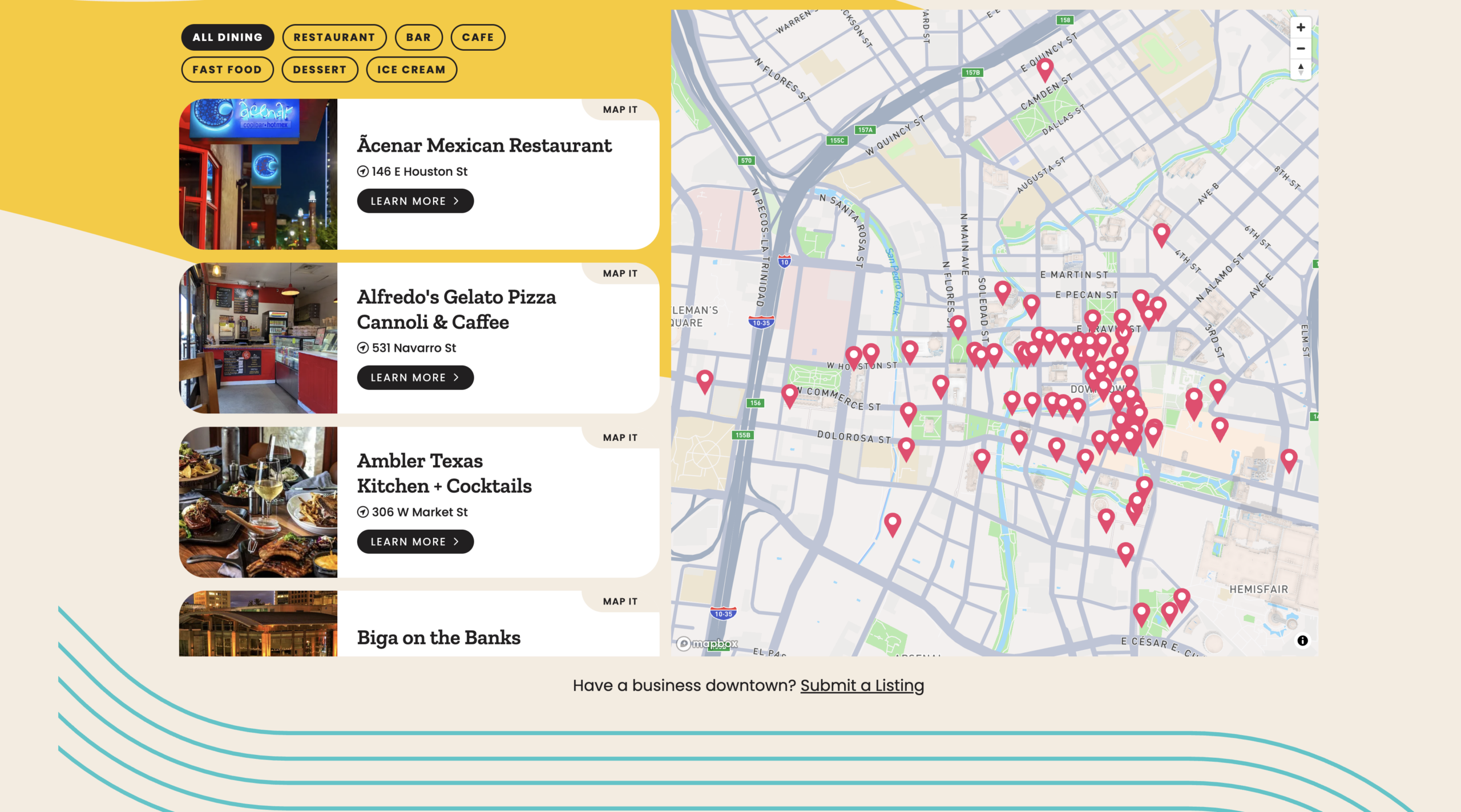
Bright Brothers Strategy Group worked with the place management org to better understand what works, what doesn’t and where and how to pivot. We did iterative rounds of intake from staff and stakeholders, to civic leaders, community members and ran a Community Intercept Survey to better understand the needs/wants and direction of its community. We developed ten targeted, custom Personas which now drive the planning of Marketing, Communications, events and placemaking. We took the team through our proprietary Visual Identity Exercise and were able to distill down the vibe that CENTRO was looking for. We developed their new Visual Identity and Brand Architecture documented in their Brand Book, and began developing assets and tools the UPMO now uses in their public realm.
The Result
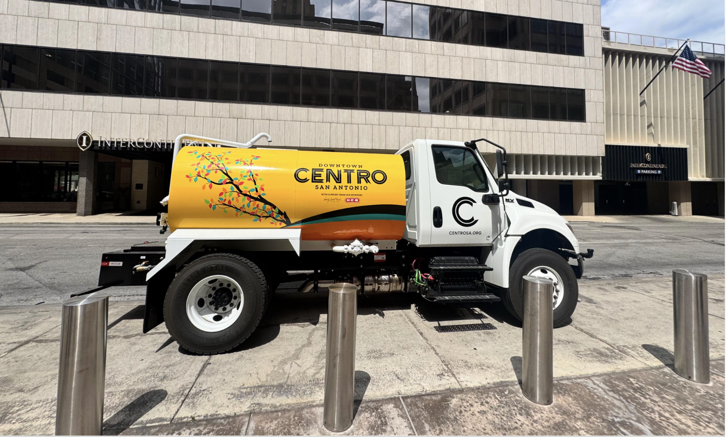
The new Visual Identity for CENTRO is based in an authentic sense of place, embodying the “puro” vibe that embodies San Antonio. The new logo now includes a crucial missing component for an urban place management organization of this sort, the word DOWNTOWN now cleverly couches their brand in a “hamburger” formation that underscores that this entity is the one responsible for keeping downtown San Antonio vibrant, beautiful and full of life. The former “fiesta” feel has been traded in for a more buttoned up version, that underscores the org’s role as a convener of business, the creative arts, and the downtown community as a whole. The brand roll-out has included a new Geocentric website for CENTRO based on the brand standards we developed for the PID, new street pole banners installing a genuine sense of place, and branded assets like the Operations vehicle shown below. Cheers to Downtown CENTRO San Antonio for having the bravery to “grow up” with Bright Brothers!